
Compare a question, not just two pictures
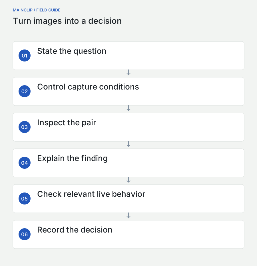
To compare screenshots on a Mac, capture the same view under controlled conditions, place the two images together, inspect the visible changes, and explain which differences matter. A pixel-difference view can help locate changed areas, but it cannot decide whether an interface is correct, usable, or accessible. The strongest comparison combines a fair pair of screenshots with a specific question and a short written conclusion.
For example, “Did the new spacing prevent the German button label from being clipped?” is a useful comparison question. “Which screenshot is better?” is much harder to answer because it mixes readability, visual preference, behavior, and purpose. Define the question before capturing. You will know what must stay constant, what should change, and what additional checks are needed beyond the image.
MainSnap includes a before-and-after comparison view, a Highlight changes option, and comparison export. These features help with manual visual review. They are not an automated test runner, an accessibility audit, or a semantic image-analysis service. This guide explains how to use them accurately, including the requirement for matching pixel dimensions in the difference view and the distinction between the interactive comparison and its exported image.
The worked cases use hypothetical interfaces and sample content. They illustrate a repeatable review method rather than report a benchmark or an actual customer test. You can adapt them to product design, support, documentation, website review, and everyday checks on your Mac.
Build a fair pair of screenshots
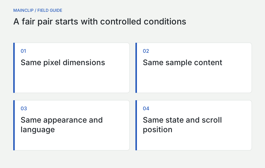
A comparison is only as useful as the relationship between its inputs. If one screenshot uses a different window width, language, account, scroll position, or display scale, much of the visible difference may have nothing to do with the change you intended to review. Control the conditions that matter and record any conditions you cannot hold constant.
Imagine comparing a settings panel before and after a layout adjustment. The earlier screenshot has an English label, while the later screenshot has a longer French translation. If the question is whether the spacing changed, language is an unwanted variable. If the question is whether the layout handles translation, language is the deliberate variable. The same pair can be useful or misleading depending on the question.
| Condition | Keep consistent for a like-for-like comparison | Change deliberately when testing |
|---|---|---|
| Window and capture dimensions | Same region and actual pixel size | Responsive or minimum-size behavior |
| Content | Same sample records and text | Long, empty, or unusual values |
| Appearance | Same light or dark mode | Appearance-specific rendering |
| Language and direction | Same locale and text direction | Localization and bidirectional layouts |
| State | Same selection, focus, and scroll position | Errors, loading, disabled controls, and focus |
| Environment | Same display and source-app zoom where practical | A specifically documented environment difference |
Write a capture recipe
A capture recipe is a few lines describing how to reach the image. It might say: open the sample project, choose the Notifications panel, set the window to the agreed width, select the second option, move the pointer outside the content, and capture the same region. Another person should be able to follow it without guessing which account or record you used.
The recipe need not reproduce every detail of the Mac. Include the details that can change the answer. If the bug depends on a long filename, record that filename as harmless sample text. If it depends on a narrow window, record the width or a reproducible window arrangement. If a live timestamp is irrelevant, choose a static example or note that its difference should be ignored during interpretation.
Keep source and delivery copies distinct
Retain the unannotated screenshots used for the comparison. Make annotated or redacted delivery copies separately when needed. Otherwise, an arrow added to only one image can become one of the largest highlighted differences, obscuring the interface change under review. A clean source pair lets you revisit the analysis without recreating the screen.
Do not call a reconstructed mockup a screenshot of the implemented app. A design image can be a useful comparison target, but label it as a design reference and explain that the question concerns implementation alignment. The reader should know whether both images came from running software, whether one is a mockup, or whether either was modified for privacy.
Use MainSnap's comparison modes accurately
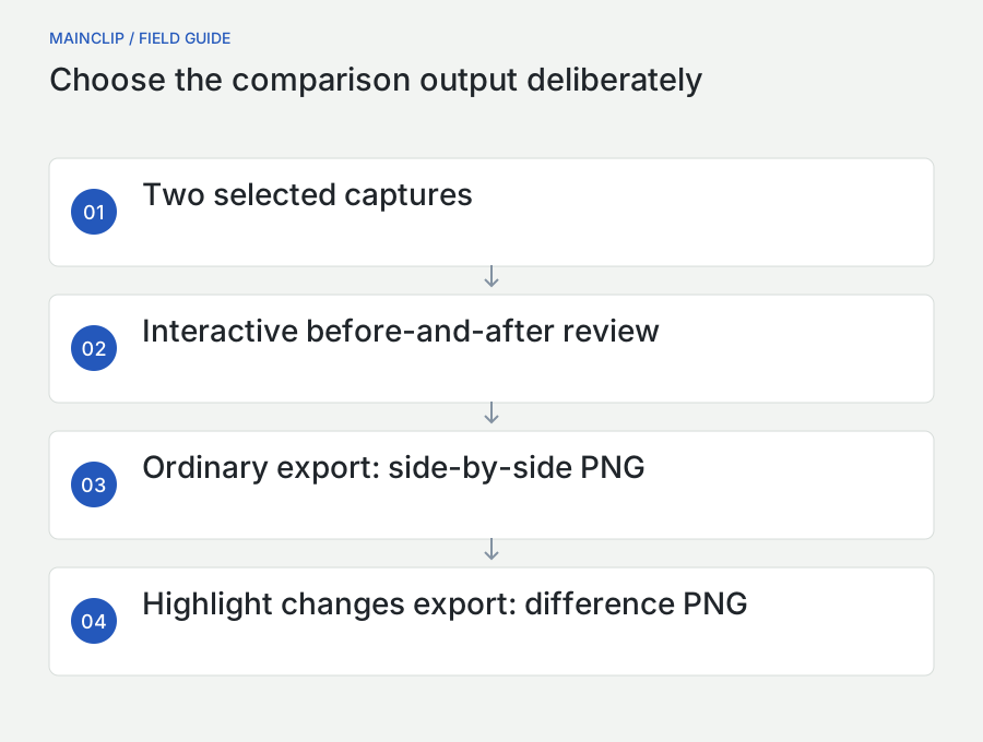
In MainSnap's library, select two captures and choose Compare. The current implementation orders the selected captures by their creation time, with the earlier capture first. Check that this order matches the before-and-after story you intend to tell, particularly when images were imported rather than captured in chronological order. Do not assume the order in which you clicked the items establishes the comparison sequence.
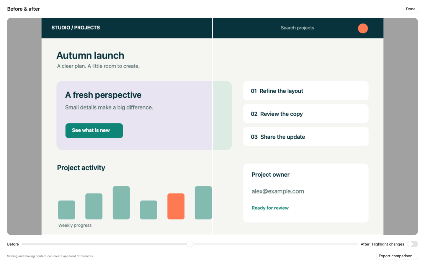
The before-and-after view lets you move a divider to reveal the two images within one viewing area. This is useful for alignment, spacing, and localized changes because your eyes can stay on one position while the visible source changes. Use Highlight changes to switch to a generated difference image when the two inputs have the same pixel dimensions.
- Prepare two captures that answer the same review question.
- Check their actual pixel dimensions and intended chronological order.
- Select the two captures in the library and open Compare.
- Use the before-and-after divider to inspect important regions.
- Enable Highlight changes when a pixel comparison will be meaningful.
- Return to the original images to interpret highlighted areas.
- Export the appropriate comparison and add a written explanation.
Understand what Export comparison creates
With Highlight changes enabled, MainSnap exports the generated difference image as PNG. In the ordinary before-and-after mode, it exports a side-by-side combination of the two images. It does not export a live interactive slider, and the ordinary export is not a screenshot of the divider at its current position. This distinction helps you choose the right output for an email, issue, or report.
Open the exported PNG before sending it. Add clear surrounding text identifying which image is earlier and which is later. If the order is not self-evident, label the delivery composition in a suitable editing step or explain the order in the caption. Do not make a reviewer infer chronology from a subtle visual difference.
Compare the actual edited images deliberately
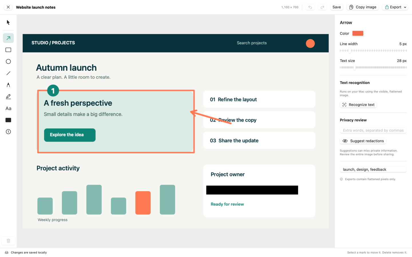
MainSnap's comparison receives flattened renders of the selected captures, including their annotations. This is useful if you want to compare two prepared explanations, but it matters when diagnosing an interface change. A redaction or arrow present in only one image will affect the comparison. Choose clean captures or apply equivalent privacy treatment to both if the difference view is intended to focus on the interface.
Equivalent treatment does not mean hiding inconvenient evidence. If a region is removed for privacy, state that limitation and avoid drawing conclusions about the hidden content. Preserve the private source pair only when there is a legitimate need and an appropriate place for it. The public comparison should be accurate about what readers can and cannot inspect.
Read a pixel difference as a locator
A pixel comparison asks whether corresponding samples differ enough according to its rule. It does not ask whether a button is more understandable, whether a paragraph is factually correct, or whether a person can complete a task. A highlighted region is a place to investigate. An unhighlighted region is not a certificate of correctness.
MainSnap's current difference implementation compares corresponding color samples after rendering the images into its working image context. Differences above an internal threshold are marked in a coral color, while other areas appear pale. There is no user-facing percentage-of-correctness score, semantic change report, automatic alignment control, or threshold slider advertised here. Keep the interpretation within what the tool actually does.
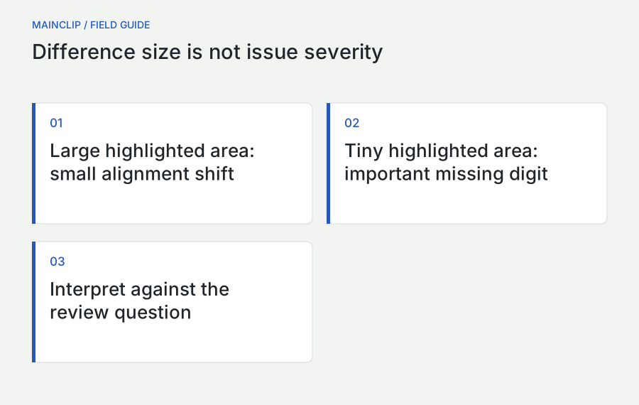
Large highlighted areas can have a small cause
Move an entire panel by a few pixels and many edges will no longer line up. The result may look dramatic even though the underlying cause is one spacing change. Change a font or rendering environment and text across the whole screen may differ. The area of highlighting is therefore not a direct measure of the seriousness or complexity of the change.
When a difference view is noisy, return to the source pair and inspect alignment first. Check dimensions, window position within the capture, scroll offset, and scale. If those differ unintentionally, recapture a fair pair. Do not spend twenty minutes classifying highlights that were created by a mismatched setup rather than the product change.
Small highlighted areas can matter greatly
A missing decimal point, a changed currency symbol, a clipped final letter, or a disabled-state indicator may occupy very few pixels. Its importance depends on the task. A small visual change can alter the meaning of an amount or make a control look unavailable. Read relevant text and states directly instead of prioritizing only the largest colored regions.
For a content review, make a list of fields whose meaning matters and check them explicitly. For a layout review, inspect boundaries, alignment, and wrapping. For a state review, confirm the actual interaction in the running app. The difference image can direct attention, but the checklist should come from the purpose of the review.
A threshold creates deliberate limits
A thresholded view does not highlight every possible numerical difference. That can make the image easier to inspect, but it also means subtle changes may be absent from the visualization. If the question concerns a faint border or a small color adjustment, inspect the original images and use a tool suited to that measurement when necessary. Do not treat the absence of coral marks as proof that every color sample is identical.
The same caution applies to a visually pale result. It may indicate little change under the implemented comparison rule, or it may reflect differences that fall below that rule's threshold. Describe the observation precisely: “The highlight view did not mark this region, and the source images were also inspected.” Avoid claiming a stronger verification than the method supports.
Control alignment, dimensions, and scale
MainSnap requires matching pixel dimensions for its difference view. Equal dimensions are necessary for its corresponding-pixel comparison, but they are not sufficient for a meaningful result. Two 1,600-by-1,000 images can show different scroll positions or differently sized content. Check both the file dimensions and what those pixels represent.
macOS distinguishes interface layout units from the pixels used to render them. Apple's high-resolution documentation explains that separation, which is why a window's apparent size is not a complete description of a capture. See Apple's high-resolution drawing explanation. For your review, record actual image dimensions and avoid switching displays or source zoom levels between captures unless that is the variable being tested.
Do not resize away the condition you are testing
If the purpose is to check a narrow-window layout, stretching that screenshot to match a wider screenshot hides the very condition under review. Use a side-by-side presentation with dimensions labeled and explain that the images represent different widths. Pixel differencing is inappropriate when corresponding positions do not represent the same intended layout.
If a mismatch is accidental, recapture rather than forcing the files into agreement through arbitrary resizing. Resampling changes the pixel representation and can introduce its own differences. A comparison built from two consistently captured sources is easier to interpret and defend than one requiring several undocumented transformations before it can be opened.
Use fixed visual landmarks
Check a few landmarks before interpreting detail: the upper-left corner of a panel, a divider line, a stable heading, and the bottom edge of a primary control. If all of them shift together, the pair may be offset. If one shifts while the others stay aligned, that may be the actual local change you need to investigate.
Landmarks are especially helpful when two images look almost identical at first glance. They give your eyes a repeatable route and help distinguish whole-frame movement from a component-level adjustment. Record a relevant offset in the review note rather than letting the difference image imply that dozens of unrelated elements changed independently.
Remove accidental motion and unstable content
Live interfaces contain changing details: clocks, counters, loading indicators, rotating banners, thumbnails, notifications, and animated selection states. These can dominate a comparison even when the product code under review has not changed. Decide which dynamic elements matter to the question and which should be stabilized through the sample setup.
For a layout review, use fixed sample records and wait for loading to finish. Move the pointer away from controls so hover states do not differ accidentally. Keep keyboard focus consistent. If an animation cannot be stabilized, document it and avoid interpreting its highlighted region as a regression. The aim is a reproducible observation, not a visually spotless image at any cost.
Capture a meaningful state, not a random instant
A loading screen captured at different moments can show different content for valid reasons. Define the state in terms a person can reproduce: the list has finished loading, the error message is visible, or the save operation has completed. A fixed delay may help in some situations, but “wait two seconds” is not always equivalent to “wait until ready.”
When the issue itself is timing-related, a static screenshot may be insufficient. Record the sequence in written steps and use an appropriate video or interaction-testing tool if needed. MainSnap's released feature set covers still images, not video capture. Do not stretch a still-image comparison into evidence of a complete timing sequence.
Keep test data representative
Stable sample content should still exercise the layout. A list of three short names may hide problems caused by long labels, missing values, or many rows. Choose a small set of deliberately varied fictional records and use it consistently across the before-and-after pair. That gives you repeatability without making the test unrealistically easy.
For example, include one short label, one long label, one empty optional field, and one unusual but valid character sequence. State which cases are included. A reviewer can then see why a particular line wraps and whether that wrap is expected. Consistent content turns the screenshot into a useful test fixture rather than a decorative example.
Separate visual difference from product meaning
A screenshot tells you what was visible at one moment. It does not directly tell you why it appeared, whether a control responds correctly, or whether the data behind it is valid. A label can be perfectly aligned while describing the wrong action. A button can look enabled while failing when clicked. A screen can look unchanged while its keyboard behavior has regressed.
After locating differences, classify them by their effect. An intentional design change may be acceptable. An unintended shift may be cosmetic. A clipped warning may prevent understanding. A changed number may indicate a content or data problem. The classification should lead to an action, such as accepting the change, adjusting the layout, checking the source data, or performing an interaction test.
| Observation | What the screenshot supports | What to check next |
|---|---|---|
| A button moved lower | Its visible position differs | Whether the new grouping is intended and usable |
| A label is clipped | The captured state truncates visible text | Other widths, languages, and text settings |
| A value changed | The displayed value differs | Data source and expected meaning |
| No obvious visual change | The captured states look similar | Relevant behavior and accessibility checks |
| Many text edges differ | Rendering differs broadly | Scale, font, environment, and actual content |
Write findings as observations plus implications
A useful finding says what changed, where, and why it matters. For example: “At the narrow window size, the final word of the export warning is hidden below the panel. A reader cannot see the condition that explains the disabled button.” This is much more actionable than “the new screenshot looks broken.” The image provides evidence; the sentence explains its significance.
Avoid diagnosing an implementation cause from appearance alone. A shifted label might come from a margin, a font change, a different container, or different content. Report the visible behavior first, then let the implementation investigation establish the cause. This keeps visual review precise and reduces unhelpful debate about a guess that the screenshot cannot prove.
Use screenshots within a broader accessibility review
Screenshots can reveal clipped text, weak visual separation, confusing grouping, or a focus indicator that is hard to see. They cannot show the full accessibility information exposed to assistive technology or prove that a keyboard user can complete a task. Treat visual comparison as one source of evidence within a broader review.
W3C explains that accessibility evaluation requires knowledgeable human judgment and that no tool alone determines whether a site meets accessibility standards. That boundary applies even more strongly to a simple image comparison. See W3C's accessibility evaluation overview. Do not describe a clean difference image as an accessibility pass.
Check the live interface for nonvisual behavior
Use the running app or page to check the relevant keyboard route, focus order, control names, and state feedback. A screenshot can document one visible focus state, but it does not show where focus came from or where it goes next. A static image also cannot establish that a screen reader announces the right label or that an error is communicated at the right time.
For native Mac development, Apple's Accessibility Inspector can examine accessibility information and help identify issues in the view hierarchy. That is a different capability from comparing raster images. See Apple's Accessibility Inspector documentation. Use the appropriate tool for the question rather than expecting one screenshot workflow to cover every quality dimension.
Make the review artifact accessible too
When sharing a comparison, include a written description of the important differences. Do not rely only on coral highlighting, a red arrow, or “see the image.” State the affected control and the observed issue in text. If the image appears in a web page, provide useful alternative text and a caption that explains the comparison's purpose.
Use labels such as “Earlier version” and “Revised version” where they help, rather than asking readers to distinguish states solely by color. Keep annotation contrast strong and text large enough at the delivered size. The review artifact should help a colleague understand the finding even when they cannot comfortably inspect the full image.
Build a small set of repeatable review cases
A single polished screenshot rarely represents an entire interface. Choose a compact set of states that exercise the parts most likely to change. For a settings panel, that might include the normal state, the minimum comfortable window size, a long translation, a disabled control with an explanation, and an error state. Each case should have a reason to exist.
Do not create dozens of nearly identical images merely to make the review look thorough. The useful question is whether the set covers meaningful variations. A long-label case may expose more than five screenshots of the default English layout. A keyboard-focus case may reveal something absent from every pointer-driven capture. Pick cases according to the product's behavior and audience.
Name cases by the condition they exercise
Use names such as “settings-long-label-dark” or “export-error-narrow” rather than “screen-01” and “screen-02.” The name should help the next reviewer understand why the image exists. Keep the app version or review date in the accompanying record, not necessarily in every visible caption. Consistent names make it easier to compare the same case across revisions.
For each case, record expected behavior in plain language. “The complete warning remains visible without overlapping the action button” is a useful expectation. “Looks good” is not. The expectation guides both capture and interpretation and makes it easier to decide whether a later difference is intentional or problematic.
Separate baseline maintenance from approval
A baseline is a reference, not automatically the correct design forever. When a change is intentional, update the reference after review and preserve enough history to explain the decision. Do not replace every earlier image simply because the new version differs. That would turn comparison into a record of whatever happened most recently, rather than a useful check.
When a baseline is wrong, fix it deliberately. Perhaps the earlier screenshot contains a known clipped label or outdated wording. Note the correction so future reviewers do not waste time treating the old image as an unquestionable standard. A good baseline is an agreed reference for a stated purpose, with limits that are visible to the team.
Three worked comparison cases
A long button label after localization
A fictional export dialog is being reviewed in German. The earlier version clips the final word of a long action label. The revised version gives the button more room. Capture both using the same translated text, window dimensions, appearance, and sample data. The before-and-after view should make the label boundary easy to inspect.
The difference view may highlight the button and neighboring spacing. Read the complete label directly and verify that the surrounding controls still fit. Then test the live button to confirm its action and keyboard behavior. The conclusion can be specific: the label is fully visible in this reviewed state, while other widths and languages require their own cases. Avoid converting one screenshot pair into a claim about every localization.
A website card layout at a narrow width
A website update changes the spacing inside product cards. Capture the earlier and revised pages at the same viewport width, zoom, content state, and scroll position. Wait until fonts and images have loaded. If the cards now wrap differently, the highlighted area may be large because many elements move together. Inspect the overall structure before treating each changed edge as a separate problem.
Check whether the title remains readable, the call to action stays associated with the correct product, and the card does not overlap neighboring content. Then use the actual page to check interaction and keyboard navigation. For a responsive review, repeat at another meaningful width as a separate case rather than stretching the narrow screenshot to match a desktop image.
An error state after a copy change
A team revises the wording of an error message to explain how to recover. The new text is longer. Capture the same error state before and after, using harmless sample content. The comparison may show only a small text region, but the meaningful question is whether the instruction is complete and whether the layout accommodates it.
Read the new sentence for accuracy, verify that it is not clipped, and perform the suggested recovery action in the running app. The screenshot supports the visual part of the review; the live check supports the behavior. A concise report records both observations separately so the reader can understand what was actually verified.
Share comparison evidence that leads to a decision
A good comparison handoff contains the review question, the two states being compared, the relevant environment, and the finding. The image should support that explanation rather than force the recipient to discover the entire story. For a small issue, a few sentences and one clear side-by-side image are often enough.
For example: “Compared the export dialog before and after the spacing change at the same narrow width. The long German label now fits, but the help sentence overlaps the lower divider. The attached image shows the reviewed state; the next step is to adjust the lower spacing and recapture this case.” This gives the recipient an observation and an action without overstating the scope.
Choose the output that matches the audience
A developer investigating alignment may benefit from the difference image plus the original pair. A product reviewer may prefer side-by-side images with clear captions. A support recipient may need only the corrected image and the instruction it illustrates. Avoid sending every available artifact when one or two explain the issue more clearly.
If you share a difference image, explain its colors and limitations. A reader unfamiliar with the tool may otherwise interpret pale areas as deleted content or coral areas as errors. State that the highlighting locates pixel differences according to the tool's comparison rule; the written finding identifies which changes are relevant to the review.
Remove unrelated private information from both sides
Review both source images and the final composition for account details, filenames, notifications, and other incidental information. A redaction in the earlier image does not cover the later image. If a public comparison requires privacy edits, keep those edits consistent and disclose when they limit the visible evidence.
MainSnap's exports use flattened visual images, while editable captures retain their originals locally. Share the reviewed output rather than the private working capture. Open the exact exported file before attaching it, and check that its ordering and labels agree with the accompanying text. This catches ordinary handoff mistakes that no pixel comparison can prevent.
Run a focused comparison practice session
You can learn the strengths and limits of the workflow with a harmless document or sample interface you control. Create a simple panel containing a heading, two short labels, a long sentence, a button-like shape, and a thin divider. Capture a baseline, then make one deliberate change at a time. Keep the original setup so each new case can be compared with the same reference.
Start with an obvious change, such as moving the button-like shape slightly downward. Then try a smaller change, such as replacing one punctuation mark. Next, change the window or document zoom without changing the content. Finally, add a long line that causes wrapping. These cases produce different kinds of visual evidence and help you practice distinguishing content, position, scale, and layout changes.
Predict the result before opening the difference view
For each case, write one sentence about what you expect to see. A position change should affect the old and new edges of the moved object. A punctuation change should be local. A scale change may affect much of the image. The exercise encourages you to interpret a result rather than merely react to the amount of color in the highlight view.
Compare the prediction with the actual output and inspect the source pair when they differ. Perhaps the moved object also pushed another element, or perhaps a text change caused the entire paragraph to reflow. Those are useful observations. The point is not to guess the exact pixels; it is to connect a visible result with a reproducible cause in a controlled example.
Practice a misleading pair on purpose
Capture the same unchanged panel with a different scroll offset or slightly different framing. Compare it with the baseline. The resulting visual noise demonstrates why setup matters. Then recapture the same panel with the original framing and compare again. This is a simple way to teach a team that a dramatic difference image can arise from capture conditions alone.
Do not keep the misleading pair in a folder of accepted product baselines. Label it as a training example. A future colleague should not have to infer that one strange image was created to illustrate a mistake. Clear naming matters even in a practice exercise because useful examples often outlive the meeting in which they were made.
Practice a meaningful issue with little visual area
Change a fictional amount from “10.00” to “1000” or remove a small word from a warning. The highlighted area may be tiny, yet the meaning changes substantially. Ask the reviewer to explain the effect in a sentence. This balances the earlier noisy example and discourages ranking issues solely by the size of the highlighted region.
Then compare two screenshots with the same visible content but a different intended interaction in the underlying sample. The image comparison cannot establish that behavioral difference. Document it as a boundary of the method. A reviewer who understands what an artifact cannot prove is better equipped to choose the next check.
Keep a concise decision record
A comparison becomes more useful over time when its conclusion is recorded next to the images. Use a short structure: question, conditions, observation, decision, and remaining check. This preserves the reasoning without requiring a long report. It also prevents an accepted visual change from being repeatedly reported as a new issue by people who were not part of the original discussion.
For example, a fictional record might say: “Question: does the translated action label fit? Conditions: same narrow window, German, light appearance, sample project. Observation: label fits; help text wraps to two lines without overlap. Decision: accept this layout. Remaining check: keyboard focus and dark appearance.” Each statement has a clear role, and none implies that unperformed checks have passed.
Separate observations from preferences
“The button moved eight pixels” and “the button feels too low” are different kinds of feedback. Both can be useful, but the second needs a design discussion while the first is a measurable observation about the compared images. State which kind of feedback you are giving. This helps the recipient decide whether to investigate a defect, confirm an intentional change, or discuss a preference.
When several reviewers disagree, return to the task the interface supports. Is the grouping clear? Can the warning be read? Does the label describe the action? A screenshot comparison is most productive when it helps answer those questions. It becomes less useful when every difference is treated as either automatically wrong or automatically better merely because it is newer.
Close the record when the changed case is checked
After a fix, recapture the affected case under the same conditions and update the decision record. Keep the earlier finding long enough to explain the change, but identify the current accepted reference clearly. If the fix changes related states, add focused checks for those states rather than repeating unrelated reviews without a reason.
This creates a compact loop: a reproducible question, a comparable pair, a specific finding, a change, and a verified result. MainSnap supplies useful visual artifacts within that loop. The quality of the review comes from how carefully the conditions and conclusions connect to the actual product behavior.
Diagnose a noisy or misleading comparison
The entire image is highlighted
Start with alignment and environment. Are the dimensions identical? Was the window moved within the capture? Did the source zoom, appearance, or display change? Is the page at a different scroll position? If the mismatch is accidental, recapture consistently. If it is intentional, use a presentation suited to that difference and explain why a direct pixel map is not the main evidence.
The difference view rejects the images
MainSnap requires matching pixel dimensions for Highlight changes. Check the actual width and height of both images. Do not assume equal-looking previews have equal dimensions. If you need a pixel comparison, capture the same area and size again. If the images intentionally represent different layouts, compare them side by side and label their conditions.
The exported image is not the slider view I expected
MainSnap's ordinary comparison export is a side-by-side PNG, while the highlighted mode exports the generated difference image. The interactive divider is a review control, not an exported interactive artifact. Choose the mode that creates the evidence you need and inspect the saved file before sharing.
A tiny issue is hard to see in the full comparison
Provide a focused detail alongside an overview. Keep enough context to locate the issue, then make the affected text or boundary readable. Describe the problem in words as well. A reviewer should not need to repeatedly zoom and search a large desktop image to find the one character or control that matters.
When comparing captures made on different days, check whether the source environment changed independently of the product. A browser update, a newly loaded font, a different sample account, or an operating-system appearance change can affect the image. Record such changes in the comparison note rather than silently treating the earlier and later environments as identical. This does not make the comparison useless; it clarifies what conclusions the pair can support.
If the environment difference is the subject of the review, name it explicitly. A comparison of the same interface on two displays answers a different question from a comparison of two software revisions on one display. Keep separate pairs for separate questions when possible. This makes findings easier to reproduce and helps a colleague decide whether to investigate the product, the rendering environment, or the capture method. A clear explanation of the variables is often more valuable than a visually elaborate comparison image.
Questions about comparing Mac screenshots
Does a pixel difference prove a regression?
No. It proves that the tool's comparison rule detected differences between corresponding image samples. The change may be intentional, environmental, or irrelevant. A regression finding requires interpretation against expected behavior and, where relevant, a check of the running interface.
Can screenshots prove that an app is accessible?
No. They can document visible conditions, including some problems, but cannot establish the complete behavior or accessibility information of a live interface. Use visual evidence alongside appropriate interaction checks, assistive-technology review, and evaluation methods.
Should I always use the same pixel dimensions?
For MainSnap's pixel-difference mode, yes. For a broader comparison of different layouts, equal dimensions may not be the goal. A narrow-window and a wide-window case can be compared meaningfully side by side if their conditions are labeled and the question concerns responsive behavior.
What makes a comparison worth keeping?
Keep comparisons that document a decision, reproduce a problem, or establish a useful reference. Include the source states, capture conditions, and conclusion. An unexplained pile of almost identical images is difficult to reuse; a small set of named cases with clear findings becomes a practical record for future changes.