
Choose a screenshot format by what must survive
A screenshot has a job. It might show a developer the exact wording of an error, help a customer find a setting, preserve a design decision, or illustrate a report. The best format is the one that carries that information to the reader without making the file unnecessarily difficult to send. For most screenshots containing interface text, PNG is the practical starting point. JPEG deserves consideration when photographs dominate the image and a smaller attachment matters. PDF makes sense when the recipient expects a document, but putting a screenshot in a PDF does not turn its pixels into scalable type.
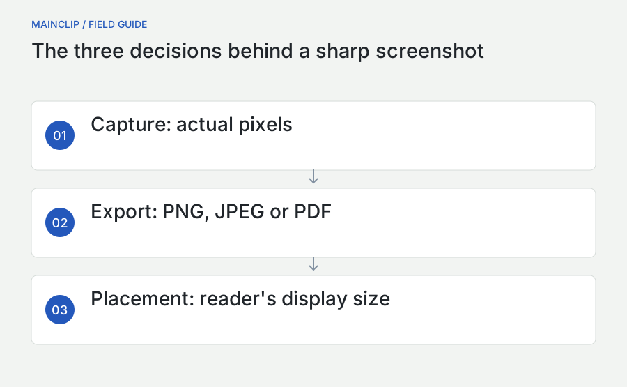
Three separate decisions often get mixed together: which file format to use, how many pixels to retain, and how large the image will appear in its destination. A perfectly good PNG can look blurry when enlarged. A large JPEG can have plenty of pixels yet show compression marks around letters. A sharp PDF page can contain a low-resolution screenshot. Solving the wrong one of these problems produces a bigger file without producing a better explanation.
This guide follows a screenshot from capture to delivery. The examples use invented settings, project names, and document sizes so that you can repeat them without exposing private information. The suggested comparisons are exercises you can run on your own Mac, not claims of a laboratory benchmark. MainSnap is discussed where its actual capture, annotation, and export features help; the same reasoning also applies to screenshots made with the tools built into macOS.
| Your main requirement | Start with | Inspect before sending |
|---|---|---|
| Readable menus, code, or error text | PNG | Small letters at the recipient's viewing size |
| A photo-heavy screen under an attachment limit | JPEG from the original image | Text edges, gradients, and fine detail |
| An image inside a document workflow | Page size, margins, and embedded image sharpness | |
| A reusable master for later edits | Original capture plus an appropriate lossless export | Which file is the original and which is ready to share |
| A small image in a web article | A deliberately sized derivative | Real rendered size on desktop and mobile |
Understand pixels, points, and the Retina effect
A pixel is a sample in the image file. A point is a unit used to lay out an interface. These are related but different. Apple's high-resolution documentation explains that macOS separates interface coordinates from the pixels used to draw them. A familiar two-times rendering scale uses two pixels along each edge for each point of interface space. That means four pixels across the corresponding area, rather than two. The practical lesson is to inspect the exported image's dimensions rather than infer them from how big the window looked. See Apple's explanation of high-resolution drawing.
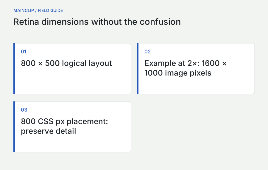
Imagine a dialog that occupies 800 by 500 logical units in a particular layout. A capture containing 1,600 by 1,000 pixels has enough samples to show it at that apparent size on a two-times display. If a website displays that same file only 800 CSS pixels wide, it can still look crisp on a high-density screen. If someone first reduces it to 800 image pixels and the site continues to display it 800 CSS pixels wide on a two-times screen, the browser must stretch fewer samples across the same physical area. That change can soften small letters even though the width displayed in the page has not changed.
Use those numbers as a worked example, not a promise that every Mac configuration exports exactly twice the visible dimensions. Display scaling, capture method, the source application, and subsequent processing all matter. When two monitors behave differently, move the window entirely onto one display, capture it, and inspect the file. Repeat on the other display without changing the content. Record actual dimensions alongside the visual comparison. This isolates the question much better than judging two differently zoomed previews.
Why a screenshot looks enormous when opened elsewhere
Some viewers initially fit an image to the available window; others show an interpretation of its actual size. A high-pixel-count screenshot can therefore look much larger in a document than it did on your desktop. This is not necessarily corruption. The destination may be placing one image pixel per document unit or choosing an initial physical size from resolution metadata. Set the display width in the destination before assuming that the file itself needs to be reduced.
For example, a 2,000-pixel-wide screenshot inserted into a narrow report column should usually be displayed at the column's width. The file may retain extra pixels to support sharp printing or enlargement. If the report becomes too large, make an intentional smaller copy later. Shrinking the source immediately just to make its first insertion look reasonable gives up detail before you know whether the destination actually requires that sacrifice.
Why changing a DPI number does not restore detail
Resolution metadata can describe how pixels map onto a physical print size. It cannot recreate letters that have already been reduced to a handful of samples. A 1,200-pixel-wide image printed four inches wide has 300 pixels per inch across that width. Printed eight inches wide, it has 150. The underlying image has not changed. Entering a larger resolution number without resampling simply proposes a smaller physical placement; it does not make the file contain a more detailed screenshot.
When a colleague asks for “a 300 DPI screenshot,” establish the required printed width as well. The useful question is whether the available pixel dimensions support the intended output. For purely onscreen work, start with pixel width and intended display width. This keeps the discussion concrete and avoids a cycle of exporting the same image with different labels while its actual readability stays identical.
Use PNG for exact interface detail
PNG is a lossless raster format with support for transparency. Its compression can reduce the stored size without intentionally discarding the image samples being encoded. These core characteristics are documented in the W3C PNG specification. In an everyday screenshot workflow, that makes PNG a useful default for text, flat panels, small icons, and diagrams. It is also a sensible exchange format when another person will add annotations before a final export.
Lossless describes the encoding step, not every step that happened before it. If you reduce an image to half its width and height and then save a PNG, the PNG faithfully stores the reduced image. If you save an already damaged JPEG as PNG, it faithfully stores the damage. A lossless format is valuable precisely because it avoids adding another intentional loss; it cannot undo earlier transformations.
Take a screenshot of a short settings list containing a toggle, a thin divider, and a small gray help sentence. These elements are useful quality probes because each carries a different kind of detail. The toggle tests boundaries between flat colors. The divider tests whether a one-pixel feature survives scaling. The help sentence tests the reader's ability to distinguish narrow characters. Keep a PNG master of this example and compare any smaller derivatives against it at equal displayed sizes.
Large PNG files are not automatically inefficient
A screenshot containing a large photograph, subtle gradients, shadows, and a translucent desktop can be much larger than an equally sized screenshot of a plain text editor. The number of pixels is only part of the storage problem; the content also matters. Two screenshots with identical dimensions can therefore have very different file sizes. A file-size target that works for a clean settings panel may be unrealistic for a full-screen photo editor.
Before changing format, ask whether the entire composition serves the explanation. A tutorial about a single checkbox rarely needs wallpaper, a dock, three other windows, and a photographic preview. Capture a more focused region if context allows it. This can reduce both visual clutter and the number of pixels without degrading any of the information the reader actually needs. MainSnap provides area capture; it does not provide a cropping tool in the released feature set discussed here.
Transparency is useful, but test the destination
A window capture may have transparent space around its visible content. That can blend neatly into a web page, yet it can also produce unexpected-looking edges against a dark background or in a document that applies its own shadow. Open the exported image against the background on which it will be used. Do not assume that a white preview represents the final composition.
If the destination requires an opaque image, make that choice deliberately in the tool preparing the final derivative. Keep the transparent original if you may need a different background later. A small amount of discipline here saves repeated recaptures: one master can serve a white manual, a dark presentation, and a neutral support portal, provided each derivative is checked in context.
Choose JPEG when the tradeoff is justified
The familiar JPEG format is widely used for photographic images, and its common lossy encoding trades some image information for smaller files. The JPEG committee describes the original standard and its variants in its JPEG 1 overview. For screenshots, the important practical question is not whether JPEG is universally good or bad. It is whether the changes introduced by your export interfere with the purpose of this particular image.
A screenshot of a photo with one large caption might tolerate a JPEG export well. A dense spreadsheet with tiny colored figures asks more of the format. A support screenshot where the difference between “0” and “O” determines the diagnosis deserves special care. File size matters, but a smaller image that causes the recipient to ask for a replacement has not saved time.
Look near high-contrast transitions when reviewing a JPEG: dark text on a pale background, the edge of a selected row, a fine red annotation, or a small icon next to a label. Then inspect broad gradients and photographs for a different set of problems. These are useful places to compare derivatives, but do not assume you will always see a defect. The source content, export settings, and final display size determine whether a difference is material.
Export once from the best available source
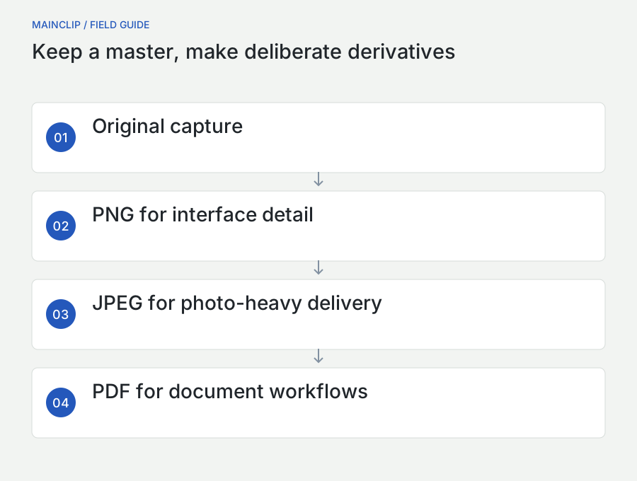
Keep the original screenshot and create each JPEG derivative from it. Avoid a workflow in which a JPEG is opened, annotated, saved, sent back, opened again, and saved at a new setting every time someone makes a minor correction. Repeated lossy exports can accumulate changes. Even when the visible result remains acceptable, it becomes harder to know which generation is your strongest source.
A clear folder convention is enough for a small project. Store the original capture separately from a folder of delivery images. Give derivatives descriptive names such as “account-settings-mail.jpg” and “account-settings-guide.png.” If the wording of the interface changes, replace the source and regenerate both versions. Do not edit the attachment from yesterday's email merely because it is the easiest copy to find.
Do not promise a universal compression percentage
A quality slider labeled 80 in one program is not a universal quality measurement that can be compared directly with 80 in another. Even within the same tool, a useful setting for a photograph may be a poor setting for a dense interface. Treat the control as a way to generate candidates, then examine the result. Record the chosen export method if several people need to produce consistent documentation.
MainSnap offers JPEG export with a fixed high-quality setting in its current implementation; it is not presented here as a compression laboratory with a tunable quality slider. If you need several delivery sizes or a strict file-size ceiling, use a separate image-preparation step on copies. This keeps the product description accurate and gives you control over the publishing requirement without pretending that every setting belongs inside the screenshot app.
Use PDF for a document requirement, not imaginary sharpness
A PDF can contain many types of content. A document created from real text and vector graphics behaves differently from a PDF page containing one screenshot. The latter still has the screenshot's finite pixels. Enlarging the page cannot reveal detail that the capture never contained. Before exporting, decide whether you want a portable image, a page for a report, or the original searchable document from which the screenshot was taken.
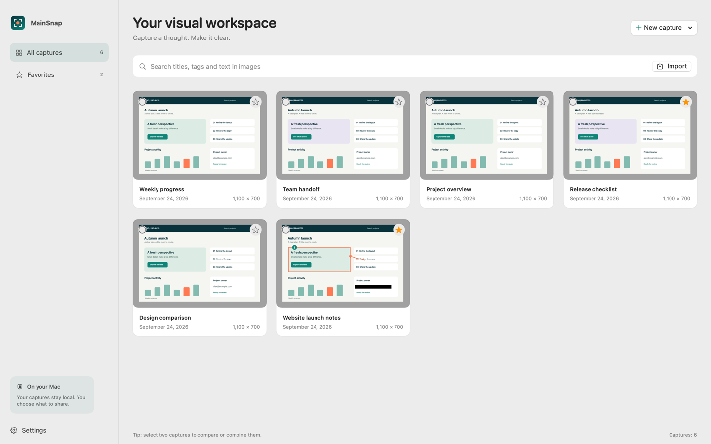
MainSnap's PNG, JPEG, and PDF exports use the flattened visual image. The PDF export is a way to deliver that image in a PDF container; it is not a conversion into editable interface elements or a promise of searchable OCR text. If your recipient needs to search a long source document, its original text-based export is usually a better starting point than twenty screenshots packaged as pages.
PDF is useful when a process explicitly expects it, when images need to sit in a broader document, or when a stable page-oriented handoff helps the reader. It is less useful when it adds an extra opening step to a simple image discussion. A teammate asking which checkbox to select may benefit more from a directly visible PNG and one sentence than from a one-page attachment with generous margins.
Check the page rather than only the preview
Open the final PDF in a different viewer if available and inspect its complete page. Is the screenshot legible at the width readers will use? Is there unexpected whitespace? Does printing at normal scale make the text too small? Can the page be understood without rotating a laptop or zooming repeatedly? These are document-layout questions, and changing the image format alone will not resolve them.
For a report with several steps, use a consistent page width and annotate before inserting. Keep captions outside the image where readers can select and copy them. If you need to explain a particular number or setting, repeat that short detail in actual document text. This supports readers who cannot comfortably inspect a dense raster image and reduces the dependence on a single exact rendering size.
Know when macOS HDR screenshots change the conversation
Apple documents a format choice on supported Macs running macOS Tahoe 26 or later: the system Screenshot app can use SDR with PNG or HDR with HEIF. Availability depends on the Mac and system version. This is a feature of Apple's Screenshot app, not a claim that MainSnap exports HDR HEIF files. The current MainSnap export choices covered in this guide are PNG, JPEG, and PDF. See Apple's current screenshot instructions.
If your task is to explain a setting to a wide audience, a broadly compatible SDR image is usually the simpler publishing choice. If the task concerns HDR media appearance, the distinction may be central to the work. In that case, include the capture method and viewing context in your notes. A reader using a different display or destination application may not see the same brightness relationships you see locally.
Do not use an unexplained HDR image as a universal color reference. The recipient's display, software, and any conversion performed by the delivery channel become part of the result. A useful handoff states what is being judged: the position of a control, a visible clipping problem, or the appearance of media under a particular configuration. These are different tasks and should not be reduced to “the screenshot looks wrong.”
Keep capture fidelity separate from compatibility
Preserving a rich source is valuable when the recipient can use it. Compatibility is valuable when the goal is a quick, predictable explanation. You can keep an original for your own records while making a more compatible derivative for a help article. Name the derivative clearly and avoid describing it as an exact representation of every property of the source display.
This distinction also prevents accidental product claims. A screen-capture app may work on a Mac with an HDR display without exporting every HDR characteristic of that display. An image viewer may open a format without displaying it identically to another viewer. Check the actual output and the actual destination. Those two observations are more useful than assuming support from a file extension or a hardware badge.
Resize around the reader's task
The most effective size is the smallest one that reliably preserves the intended information at the expected viewing distance. That statement sounds simple until a single screenshot tries to contain a complete dashboard, a tiny warning, and a detailed annotation. Often the right answer is two images: one overview that establishes location and one detail that shows what to inspect.
For example, a guide to changing a notification option could first show the relevant settings category, then show a close view of the specific control. The overview can be modest because readers only need to recognize the layout. The detail deserves enough pixels to distinguish the label and current state. Splitting the explanation this way usually reads better on a phone than squeezing an entire desktop into one narrow column.
Resample once at a deliberate stage
Each resizing operation creates a new representation of the original samples. A workflow that reduces an image, enlarges it for an annotation, and reduces it again makes quality harder to predict. Instead, annotate a strong source, keep that master, and create the final delivery size near the end. If you need a different size later, return to the master rather than enlarging the smaller derivative.
Choose a practical target based on the destination. A web article with a narrow content column has different needs from a full-screen presentation. Do not export every image at the maximum dimensions merely because storage is available. Oversized assets take longer to transfer and can make a page feel slow. Conversely, an image intended for a detailed technical review should not be reduced solely to satisfy an arbitrary thumbnail habit.
Distinguish fit-to-window from actual image quality
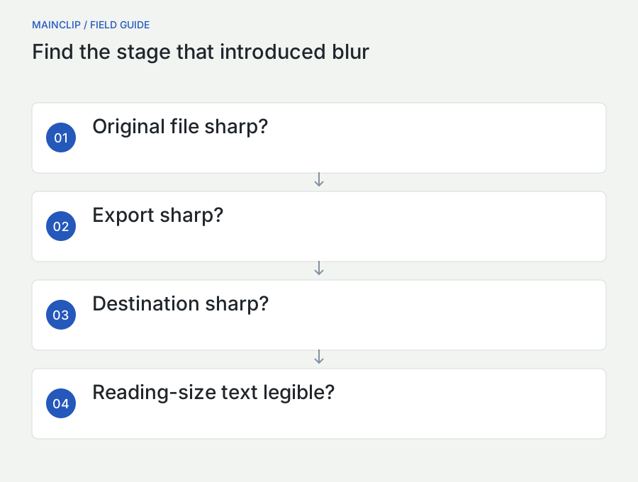
A viewer can make a sharp image look temporarily soft while fitting it to an unusual fractional scale. Compare at an appropriate inspection size and at the intended reading size. Those are two separate checks. A pixel-level view helps identify what happened during export; the reading-size view tells you whether the result communicates well. Neither should completely replace the other.
If an image is sharp at one scale but awkward at the width required by the page, consider changing the composition. Larger interface text, a narrower capture, or a separate detail panel may help more than another export format. A screenshot should be designed for its reader, even when it begins as a quick capture of an existing screen.
Test the image after the delivery channel touches it
The file you export is not always the file your recipient sees. A messaging app may display a reduced preview. A content system may generate several image sizes. A document editor may compress inserted images when it saves. A mail client may offer a choice of attachment size. Treat these as separate stages in the workflow and inspect the delivered result instead of blaming the screenshot tool immediately.
For a support ticket, upload a harmless sample through the same route you plan to use. Open the ticket as a reader would, then inspect the available image. Is there a way to open the original? Does the inline view make small text illegible? Does the platform rename attachments so that two versions become difficult to distinguish? The answers determine whether you should send a detail image, attach a file, or add a text transcription.
For a website, check both desktop and mobile layouts. The desktop page may show a generous image while the phone view compresses it into a narrow strip. Avoid embedding a complete window solely because it looked impressive at full width on your Mac. A professional guide can show context once and then use focused images for the decisions readers actually need to make.
Clipboard paste and file attachment are different routes
Pasting an image is fast, but it lets the receiving application decide how to interpret the available clipboard representation. Attaching a saved file gives you a more explicit artifact to identify and inspect. Neither route is universally superior. Use a file when the exact exported format matters, and use a paste when the destination preserves the result adequately for the task.
MainClip can retain supported clipboard content locally while monitoring is enabled, making repeated use of a useful image more convenient. It does not change a low-resolution capture into a high-resolution one, and it does not perform OCR or cloud image enhancement. Keep the source image and the destination's handling in view. A clipboard history solves retrieval; it does not replace image-quality decisions.
Make annotations survive the final size
An arrow that looks tasteful on a large desktop can become nearly invisible in a small web image. A text label can cover exactly the control it intends to explain. Annotation quality therefore depends on final placement, not only on editing comfort. Before exporting, ask whether each mark still helps when the image is displayed at the width the reader will see.
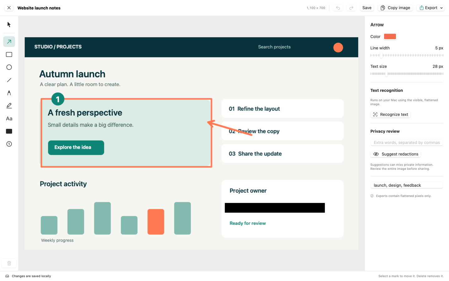
MainSnap includes arrows, lines, shapes, text, highlights, numbered steps, and solid redactions. Use them with distinct purposes. An arrow connects a short instruction to a location. A number connects the picture to a sequence in surrounding prose. A highlight draws attention without changing the interface wording. A redaction removes covered pixels from a flattened export; it should not be treated as decorative emphasis.
Use one visual grammar throughout a guide
Choose a consistent approach before making twenty images. For example, use numbered circles for ordered actions and arrows for single points of interest. Keep label wording brief and place longer explanations in captions. A reader should not have to learn a new meaning for every color or shape. Consistency also makes future screenshots easier to produce because the author has fewer arbitrary decisions to make.
Do not rely on color alone. If two states matter, name them in text or use clearly different shapes as well. Avoid placing pale annotations over similarly pale interface elements. Review in the same light or dark page context in which the image will appear. The screenshot may be technically sharp yet difficult to understand because the annotations compete with the original interface.
Preserve an editable master and a reviewed export
An editable capture is useful when an annotation must move. A flattened export is useful when you want a predictable visual handoff. Keep those roles distinct in your file organization. In MainSnap, the editable local capture retains the original image; the shared or exported image is flattened. That distinction matters for both revision and privacy, especially when annotations include redactions.
Before sending a file, open the export itself. Do not rely on the editor view as proof that you selected the right filename or the latest revision. A simple “open, inspect, attach” routine catches many avoidable mistakes: an older JPEG, an unannotated master, or an export made before the final black box was added. Quality control starts with the exact artifact leaving your Mac.
Three practical workflows for different destinations
A crisp customer-support image
Suppose a customer needs to find an option in a settings window. Start by arranging the window so that the relevant category and the option are visible together. Remove unrelated notifications and use harmless sample content. Capture only the region needed for orientation. Add one arrow or one numbered marker, then export PNG. Open it at approximately the size a ticket or email will display it.
If the label is too small, make a tighter area capture or provide a second detail. Add the exact option name in the accompanying sentence so the customer can also search or navigate by text. Send the reviewed file and check the ticket's rendered preview. This workflow favors clarity over visual drama: its success is whether the recipient can complete the action without another message.
A photo-heavy image for an attachment limit
Suppose a colleague needs to review the placement of a photograph inside a presentation. Preserve the original capture, then create a JPEG candidate from that source. Compare the photograph and any nearby small text. Check the actual file size rather than assuming that changing the extension has solved the attachment limit. If the file remains too large, reduce the captured scope or prepare a smaller derivative.
Keep the explanation focused on layout if color fidelity is not being evaluated. If the colleague must judge exact image treatment, send the appropriate original media or document through a suitable route instead. A screenshot is a convenient description of a screen state, but it is not a substitute for every kind of source asset. Defining the review question saves both storage and misunderstanding.
A screenshot in a printed operating procedure
Suppose an operating procedure will be printed at a fixed page width. Decide the image's physical placement before reducing its pixels. Insert the screenshot into the document, add a readable caption, and print or inspect a representative page at its intended scale. If the interface text is too small, split the step into an overview and a detail instead of simply making the entire page more crowded.
Use genuine document text for the instruction and any critical values. Retain the image master with the procedure's source files so future revisions do not depend on extracting pictures from an old PDF. Export the final procedure and inspect the output, including page breaks and image placement. The screenshot file can be excellent while the document layout still needs work.
Run a repeatable quality audit in ten minutes
A short comparison exercise gives a team a shared standard without requiring specialist image software. Prepare one synthetic screen containing a heading, small help text, a thin line, a colorful icon, a gray gradient, and a photograph. Make a clean original capture. Save a PNG and a JPEG candidate, then prepare one deliberately smaller copy for comparison. Keep the filenames unambiguous.
- Record each file's pixel dimensions and size. Do not rank quality by size alone.
- Open the candidates in the same viewer and compare them at the same displayed width.
- Read the smallest important sentence without leaning closer or enlarging it.
- Inspect punctuation, narrow letters, and thin divider lines.
- Look at colored edges and the photograph separately.
- Place the preferred candidate in the real document, ticket, or web page.
- Inspect that final destination on a second screen or smaller layout if available.
- Write down the choice and the reason in one sentence.
Your result might be “PNG for settings instructions, JPEG only for photograph-dominant examples, and separate detail images whenever the control label becomes hard to read.” That is a usable house rule. It is more valuable than a universal percentage because it connects a format decision to your actual content and audience. Repeat the exercise when the publishing channel or capture setup changes materially.
Define what counts as a failure
A quality review becomes more efficient when the team agrees on concrete failure conditions. A reader cannot distinguish the relevant label. An arrow points to two possible controls. A warning's final line is cut off. The screenshot looks acceptable locally but unreadable in the support portal. These are actionable observations. “It looks a little off” may be a useful first impression, but it needs a more specific follow-up.
Keep aesthetic and functional concerns separate during review. A small shadow inconsistency may be acceptable in an urgent support answer; an ambiguous account number is not. A marketing illustration may need a more polished composition than an internal bug report. The standard should follow the purpose of the image, while readability and correct content remain nonnegotiable in either setting.
Plan an image budget for a long guide
A publishing budget is easier to manage across the whole article than through arbitrary limits on individual files. Suppose a guide needs eight images. Two establish context, four show individual controls, and two compare outcomes. Those images do not all need identical dimensions or identical file sizes. Give the comparison images enough detail to support the comparison, and let the simple location images remain lighter. This allocates quality to the information that earns it.
List each image's purpose before exporting. Beside it, record the intended display width, whether a full-size link is useful, and whether a text explanation can replace part of the visual detail. When an image consumes a disproportionate share of the page's transfer size, inspect its role. Perhaps a large photograph is decorative and can be reduced substantially. Perhaps a dense chart is essential and deserves a separate downloadable original. The decision follows meaning rather than treating every kilobyte as equally valuable.
After preparing the page, load it over a connection representative of your readers and observe the sequence. Does the first explanation appear promptly? Do images shift the surrounding text as they load? Can a reader begin the procedure before every lower image has arrived? These are publishing checks, not export-format guarantees. Keep a brief record of the chosen assets so an update to one screenshot does not accidentally reintroduce a much larger original. A professional result combines readable pictures with a page that remains comfortable to use.
Troubleshoot blur without changing everything at once
The original is sharp, but the pasted image is soft
Compare the exported file with the image shown in the receiving application. If the saved source is sharp, the problem probably enters later in the route. Try attaching the file or opening the destination's full-size view. Check whether the destination offers an image-sizing or compression choice. Avoid recapturing the screen repeatedly until you have established whether capture is actually the failing stage.
The image is sharp at full size but unreadable in a guide
This is usually a composition or placement problem. The important region is too small within the total image. Create a closer capture, split an overview from a detail, or increase the available display width. Increasing the source's pixel count alone may not help a reader who still sees the same tiny label in the same narrow column.
The file is much larger than expected
Inspect dimensions and content. A full-screen capture can contain millions of pixels that do not contribute to the instruction. Photographic areas, gradients, and visual noise can increase size. Choose a focused capture first, then consider an appropriate derivative. Preserve the original until you have verified the smaller image in the destination.
The image looks different on another screen
First distinguish sharpness from color or brightness. A resizing problem calls for different investigation from a color-management or HDR question. Compare the same file at a known display size, then record the viewers and displays involved. Avoid trying random conversions that make one setup look closer while silently changing the file for everyone else.
When reviewing storage size, distinguish encoded bytes from decoded image dimensions. A compact file still expands into pixels when an application opens it. For an illustrative 2,000-by-1,000 image, there are two million pixel positions regardless of how efficiently the file stores them. This is why a tiny compressed file is not necessarily a tiny image, and why an unusually tall stitched screenshot can be inconvenient even when its file size looks acceptable.
For a long procedure, several readable images with clear captions may work better than one extremely tall image. Readers can navigate to a step, and the publishing system can load individual illustrations as needed. Preserve continuity through numbered captions and consistent framing rather than forcing the whole process into a single raster. If you do use a long image, test scrolling and enlargement in the actual destination before deciding that its compact file size makes it the better delivery format.
Questions to settle before your next export
Is PNG always better than JPEG for screenshots?
PNG is a strong default for interface detail, but “better” depends on the task. A JPEG that preserves the relevant photograph and readable labels under a necessary size limit may be the practical choice. Compare a derivative with the original at the actual destination size. Do not discard a useful format because of a blanket rule, and do not choose a smaller file without checking what it lost.
Will PDF fix a blurry screenshot?
No. A PDF containing the same low-resolution image still contains that image's limited detail. Return to a better source, recapture the relevant region, or change the composition. Use PDF when a document format is appropriate, not as an image-repair step.
Should every screenshot be reduced before sharing?
No. Reduce when there is a clear reason and a known destination. A technical review may need the original dimensions; a small web illustration may benefit from a carefully sized copy. Make derivatives from a retained master so that an early optimization does not become a permanent limitation.
What should a professional screenshot archive contain?
Keep the source capture, a short note identifying what it demonstrates, and the reviewed delivery image. Include a version or date when the interface is likely to change. Separate private editable originals from files approved for sharing. This small amount of structure makes future updates quicker and helps the next person understand which artifact is safe and suitable to use.